To get started with CRESCENT UI the only thing which you need to do is to include our stylesheet <link> in the <head> of your html document.
<link rel="stylesheet" href="https://crescent-components.netlify.app/css/crescent.css">
 CRESCENT UI
To get started with CRESCENT UI the only thing which you need to do is to include our stylesheet <link> in the <head> of your html document.
<link rel="stylesheet" href="https://crescent-components.netlify.app/css/crescent.css">
Build beautiful circular avatars for your site. All you need do to is add the avatar class to any <img> element and our library will take care of the rest.
Make sure the image you are using is having 1:1 ratio, i.e., a square picture having the same hight and width or else if you use any rectangular picture then this may result in an oval avatar.
.png)
.png)
.png)
.png)
<img src="img/avatar/avatar (1).png" class="avatar" alt="avatar image">
Provide contextual feedback messages for typical user actions with the handful of available and flexible alert messages. Alerts are available for any length of text, as well as an optional close button. For proper styling, use one of the seven required contextual classes
<div class="alert alert-primary">
  A simple primary alert - check it out!
  <span class="alert-btn">X</span>
</div>

<div class="alert alert-secondary">
  A simple secondary alert - check it out!
  <span class="alert-btn">X</span>
</div>

<div class="alert alert-dark">
    A simple dark alert - check it out!
    <span class="alert-btn">X</span>
</div>

<div class="alert alert-success">
    A simple success alert - check it out!
    <span class="alert-btn">X</span>
</div>

<div class="alert alert-danger">
    A simple danger alert - check it out!
    <span class="alert-btn">X</span>
</div>

<div class="alert alert-warning">
    A simple warning alert - check it out!
    <span class="alert-btn">X</span>
</div>

<div class="alert alert-info">
    A simple info alert - check it out!
    <span class="alert-btn">X</span>
</div>
Badges can be used on both icon and avatar, for showing a count or any notification or online/offline status of the avatar etc.
 NEW
22
O
NEW
22
O
<div>
  <img src="/img/icon-badge/home-key.png" alt="icon with badge">
  <span class="badge">NEW</span>
</div>

<div>
  <img class="avatar" src="img/avatar/avatar (4).png" alt="avatar badge">
  <span class="badge-avatar">22</span>
</div>

<div>
  <img class="avatar" src="img/avatar/avatar (2).png" alt="avatar badge">
  <span class="badge-avatar">O</span>
</div>
A card is a flexible and extensible content container. It includes options for headers and footers, a wide variety of content, contextual background colors, and powerful display options. Cards are built with as little markup and styles as possible, but still manage to deliver a ton of control and customization. Built with flexbox, they offer easy alignment and mix well with other CRESCENT UI components.


<div class="card">
  <img src="img/card/32.jpg" class="card-img-top" alt="">
  <div class="card-body">
      <h2>Micky T-shirt</h2>
      <h4>Price: 449/-</h4>
      <button class="btn btn-primary btn-block">ADD TO CART</button>
  </div>
</div>
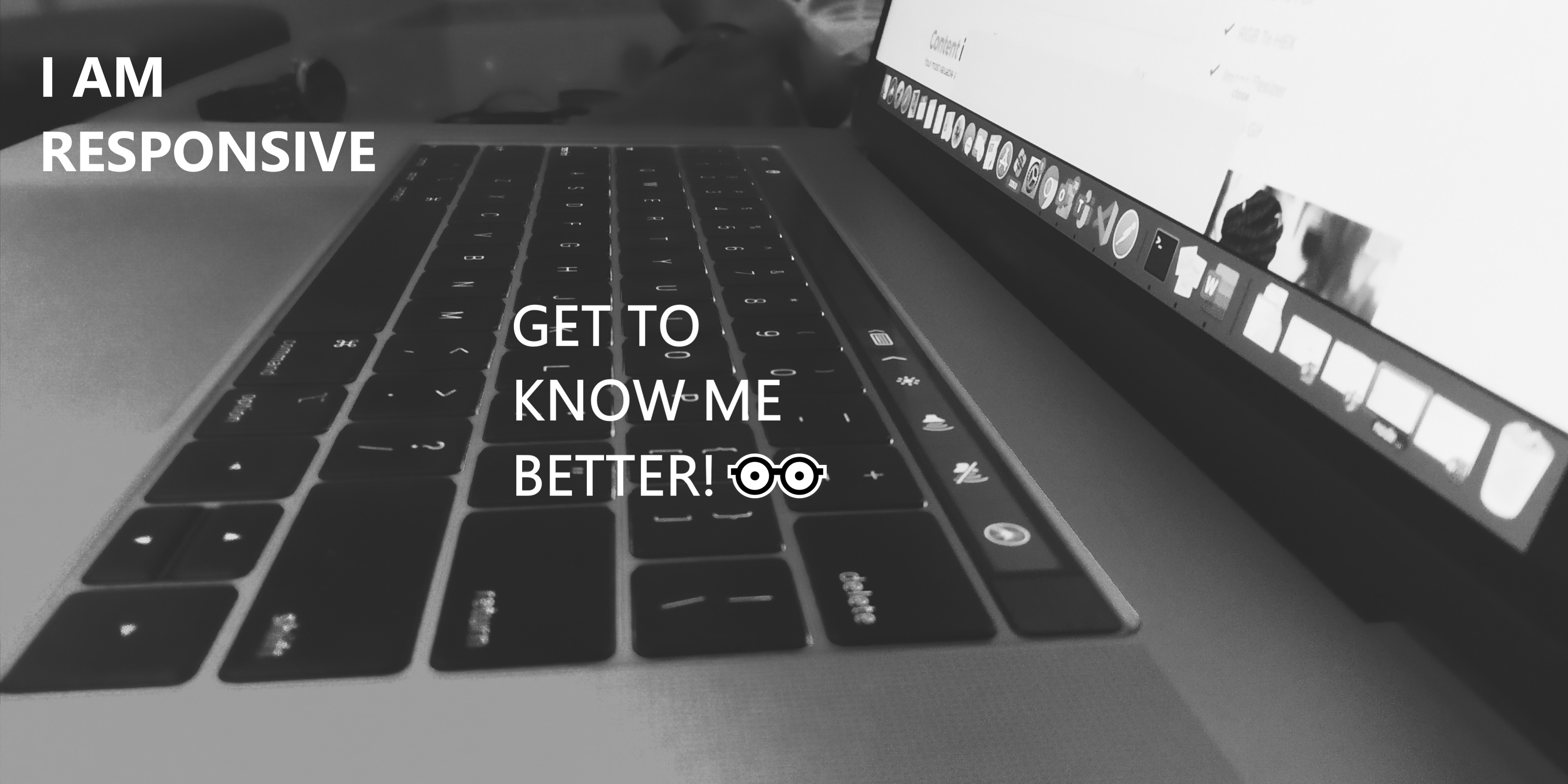
Images in CRESCENT UI are made responsive with .img-fluid class. This applies max-width: 100%; and height: auto; to the image so that it scales with the parent element.
<img class="img-fluid" src="img/img/res.jpg" alt="responsive image">
You can create rounded images by adding rounded class to it. Just make sure the image you are using is of same width and height or else it may result into an oval shaped image.

<img src="img/img/res2.jpg" class="rounded" alt="rounded image">
Add class input to your input elements to make them sleek and modern.
<input type="text" class="input" placeholder="THIS IS AN INPUT FIELD">
Assign responsive-friendly margin or padding values to an element or a subset of its sides with shorthand classes. Includes support for individual properties, all properties, and vertical and horizontal properties.
Use p-1, p-2, p-3 and p-4 for giving overall padding to components.
Use py-1, py-2, py-3 and py-4 classes to give vertical padding to components.
Use px-1, px-2, px-3 and px-4 classes to give horizontal padding to the components.
<div class="demo-div p-1">
  This div have some padding
</div>

<div class="demo-div px-1">
  This div have horizontal padding only
</div>

<div class="demo-div py-1">
  This div have vertical padding only
</div>
Use m-1, m-2, m-3 and m-4 for giving overall margin to components.
Use my-1, my-2, my-3 and my-4 classes to give vertical margin to components.
Use mx-1, mx-2, mx-3 and mx-4 classes to give horizontal margin to the components.
This text have some margin
This text have horizontal margin
This text have vertical margin
<div class="demo-div">
  <p class="m-1">
    This text have some margin
  </p>
</div>

<div class="demo-div">
  <p class="mx-1">
    This text have horizontal margin
  </p>
</div>

<div class="demo-div">
  <p class="my-1">
    This text have vertical margin
  </p>
</div>
Traditional heading elements are designed to work best in the meat of your page content. When you need a heading to stand out, consider using a display heading—a larger, slightly more opinionated heading style.
<h1 class="display-1">Display 1</h1>

<h1 class="display-2">Display 2</h1>

<h1 class="display-3">Display 3</h1>

<h1 class="display-4">Display 4</h1>

<h1 class="display-5">Display 5</h1>

<h1 class="display-6">Display 6</h1>
Make a paragraph stand out by adding lead class.
This is a lead paragraph.
A quick brown fox jumps over a lazy dog.
<p class="lead">
  This is a lead paragraph. <br>
  A quick brown fox jumps over a lazy dog.
</p>
Make any text center aligned, just add center class to it.
This is center aligned lead text.
<p class="lead center">
  This is center aligned lead text.
</p>